To help me decide which cell design/colour way to base my world around I earlier created some colour palettes of the most popular and my favourite colour ways. I have since decided to go for cell #1 of the red sheet. I like the idea of the red background because it both fits well with the Saul Bass aesthetic as well as the science matter of cells inside the human body.
I also like the brightness of the teal colouring of the cell, some of my friends even told me that this teal colouring likes to appear accidently throughout a lot of my work so I thought why not embrace it!
Here are some colour palettes focusing on the world around this cell. I have done a few experiments with them including using the cut out filter!
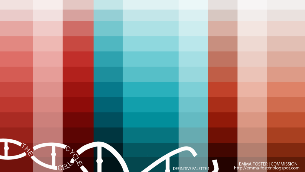
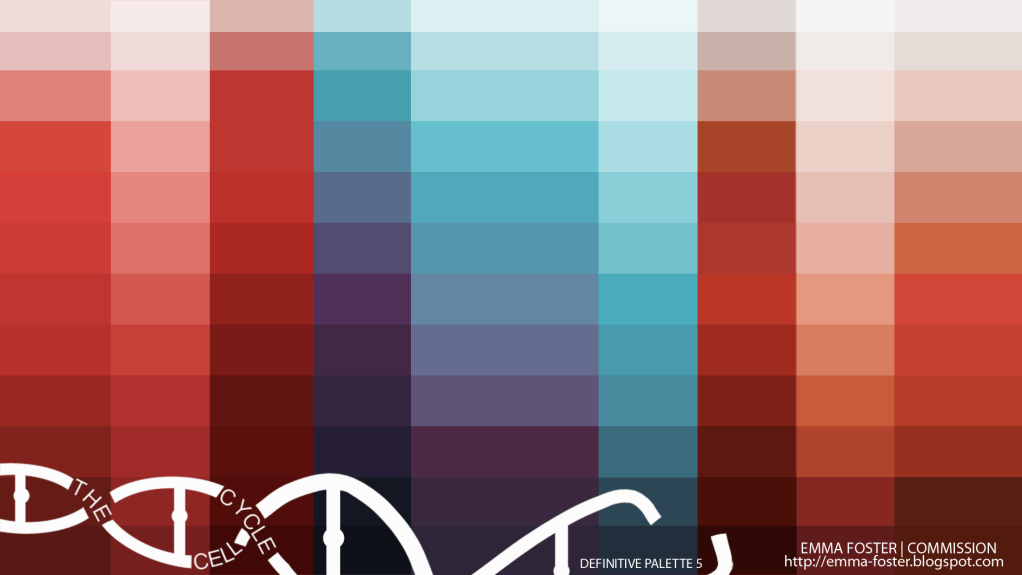
Combining the palettes from before and adding some more darker and lighter tones.
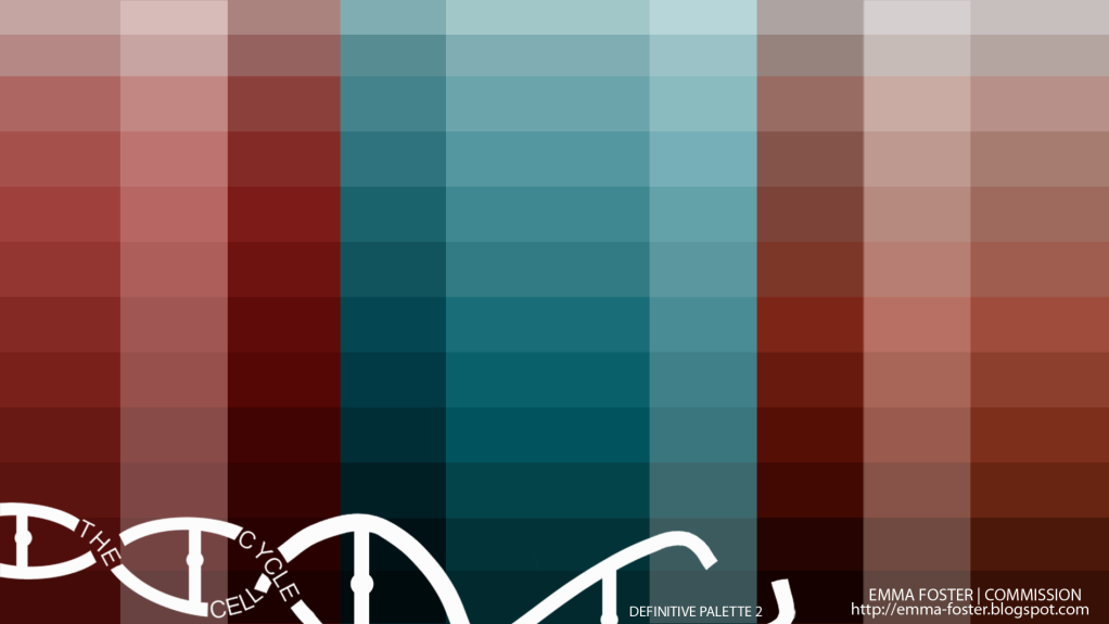
Taking away some of the brightness and contrast.
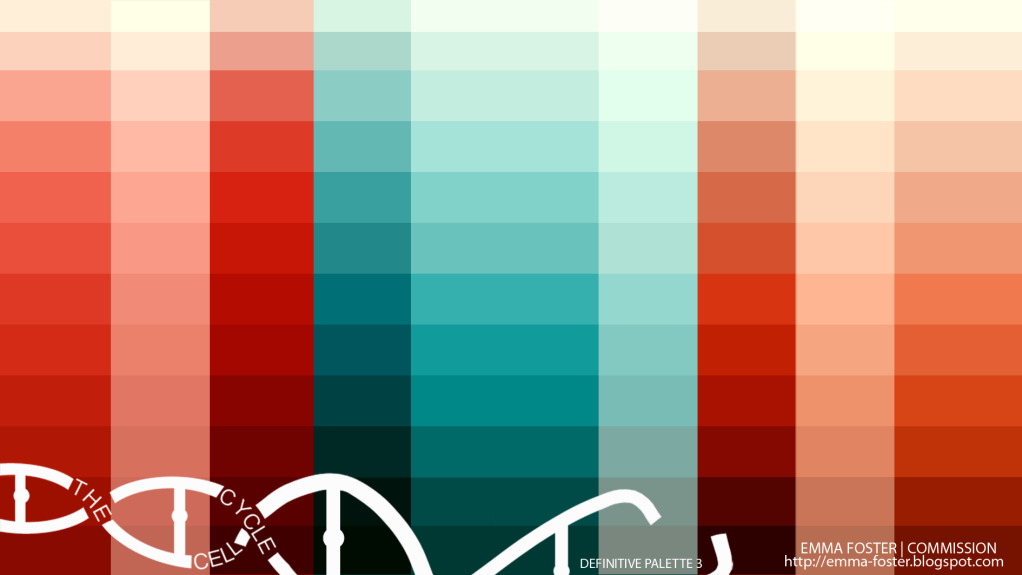
Upping the colour balance of the red.
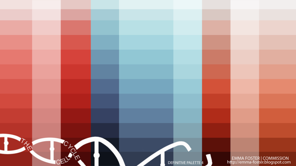
Some selective colouring. I actually like this purple/blue as well!
Some more selective colouring.
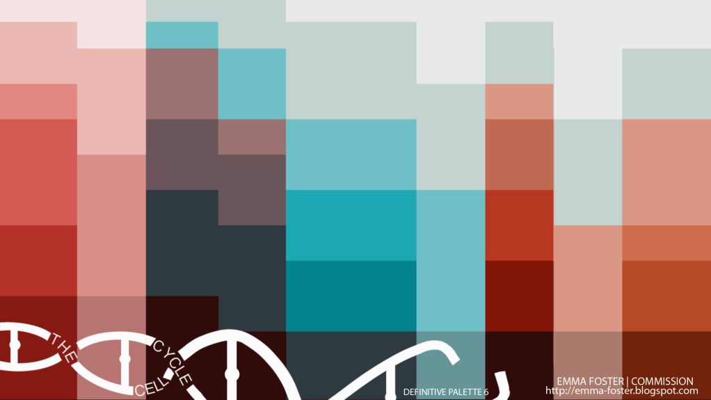
An accident with the cut out filter! But I like how key colours have been picked out and mixed.
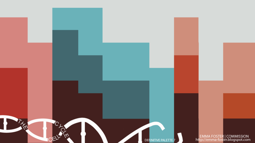
An even more simplified play with cut out


