cff

Tuesday, 27 November 2012

Character Design: Week 8 Exercises

This week in our character design lesson Justin spoke the words 'role play' and immediately my head screamed uh oh! thinking we were going to do some acting. But it actually turned out that we were to pretend that we were a group of designers producing character designs for a client which my head much preferred. :)

We were given a sort of brief of characters under the title 'Jetpack Jones' set in the 1940s and we were to do at least two each, even if it ended up with duplicates. I worked alongside Sammy and Lydia, and a bit with Anita until she got changed to form an extra group.
We started by asking ourselves what would make the characters scream 1940s and thought of a sort of Art Deco style to develop from.

I ended up creating designs for Ariana, the beautiful space princess and Boltz, Jetpack Jones' trust medical droid sidekick.
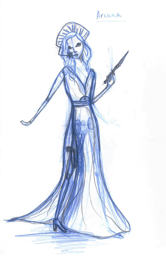
I took a lot of inspiration from the Art Deco movement looking at the art deco lady posters that are popular. I also looked at art deco patterns for accents such as Arianna's head dress, waist buckle and communication device and then looked at 1940s Hollywood actresses for a glamorous feel. Star Wars' Princess Leia was also referred to for her space princess role.
Half way through the lesson Justin changed a quality of Ariana saying that she had a water environment background so I made her accents more shell like. As the client Justin was very happy with this design.
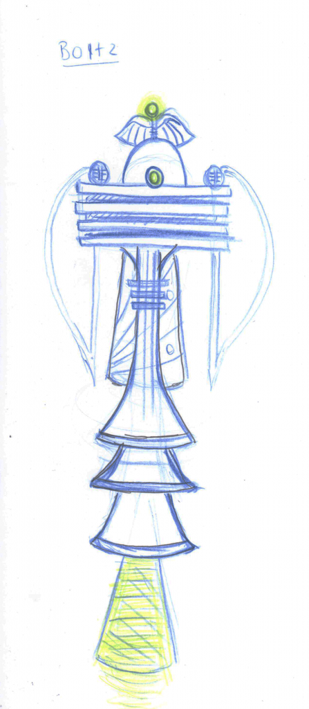
 
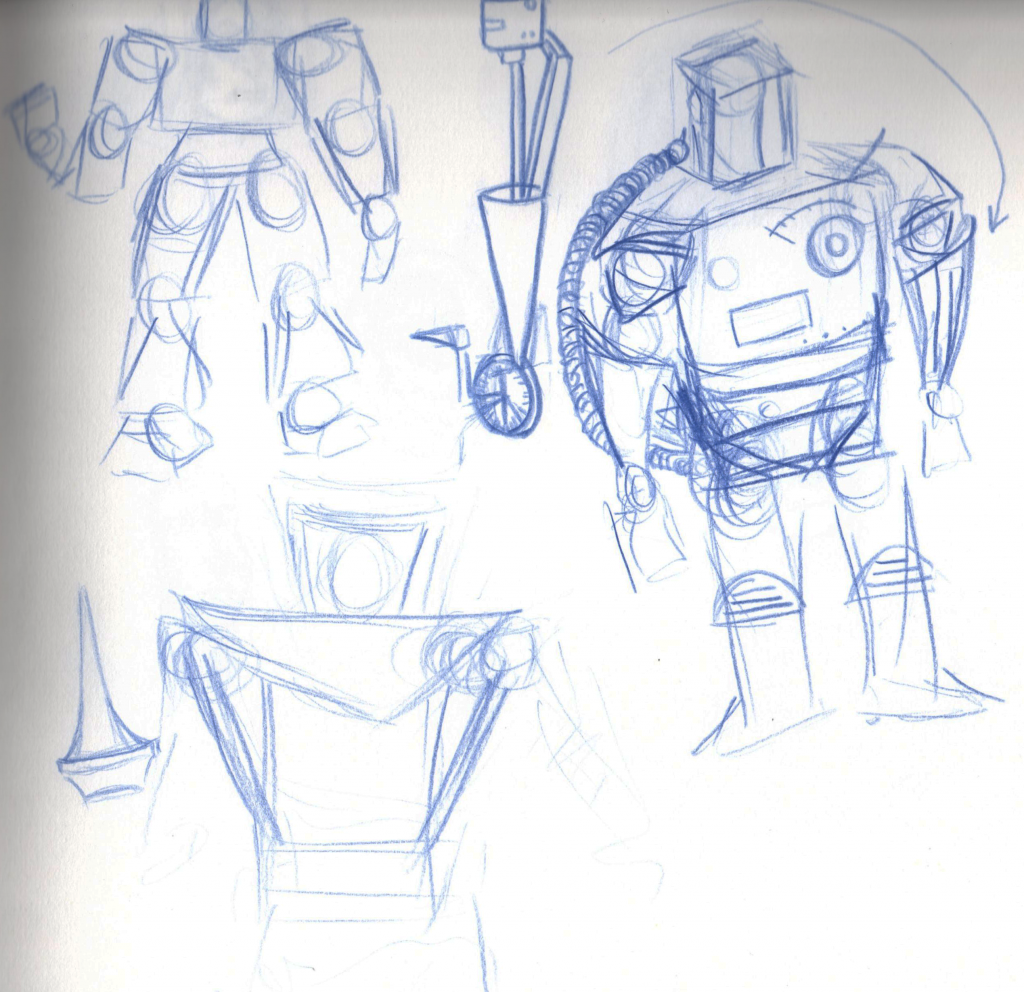
For Boltz I looked at 1940s machines and Art Deco structures. Because of his role of scanning for medical problems I decided that being able to hover would be suitable. Justin really liked the shapes and style of him however, when it came to conveying Boltz 'odd' behaviour after an accident he was too symmetrical.


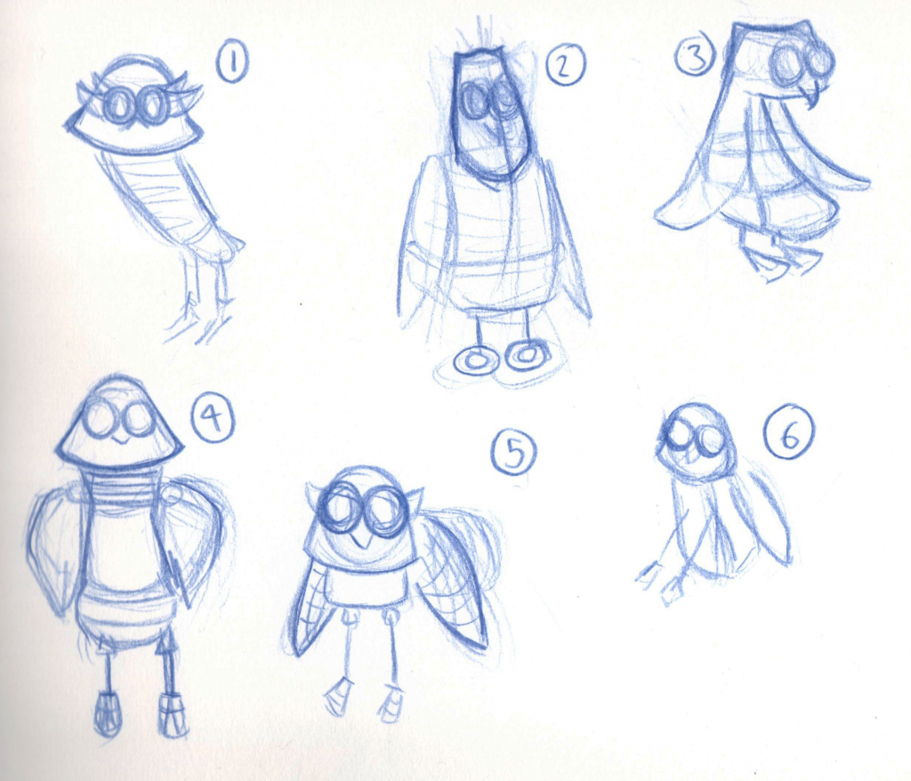
More Sidekick Sketches

As I changed my theme to the 1960s I went back to my sidekick designs and tried to adapt them to match up with my heroine and the era. #1 is a very similar version to a previous sketch but I have adjusted the shapes a little to make them more 1960s. I still don't think its there quite yet and honestly am leaning more to #1 than any of the others so I think I somehow need to find a way to develop that one which will keep it robot and owl like but also 1960s and sci-fi because right now it just doesn't seem right.

Monday, 26 November 2012

Character Design: Development of Villain

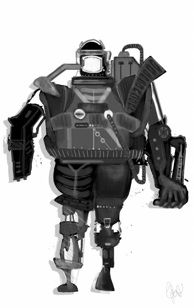
To develop my villain I took my existing silhouette and started working into it keeping in mind the markings and shapes on 1960s appliances. I also used my research into 1960s spacesuits to make sure the outerspace feel was in the design. I've just gotta develop his face a bit more and pop him inside the helmet now to complete it and see if it all fits together well enough.


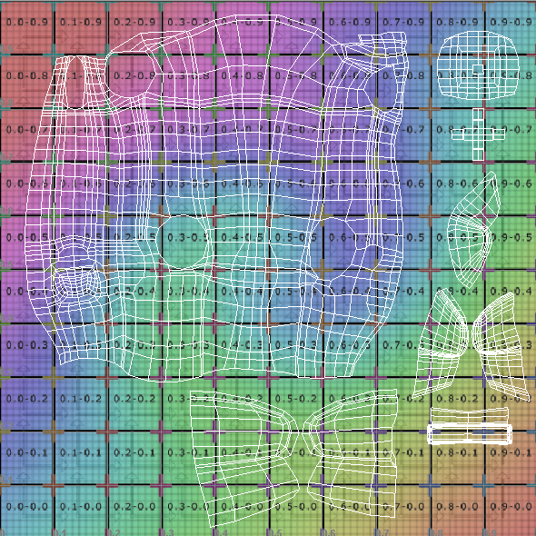
UV Mapped Plane

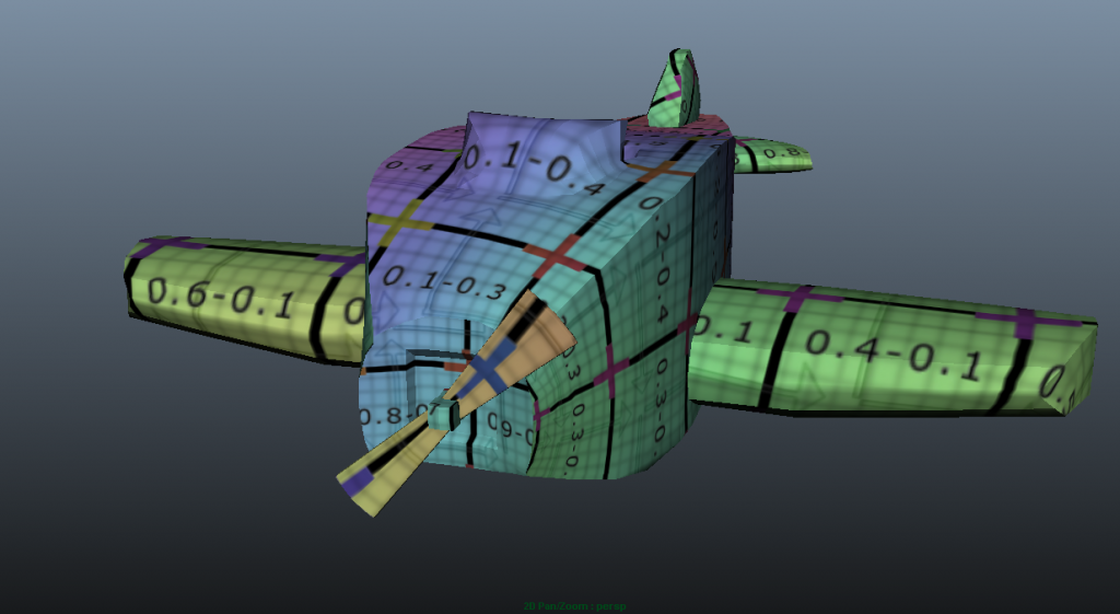
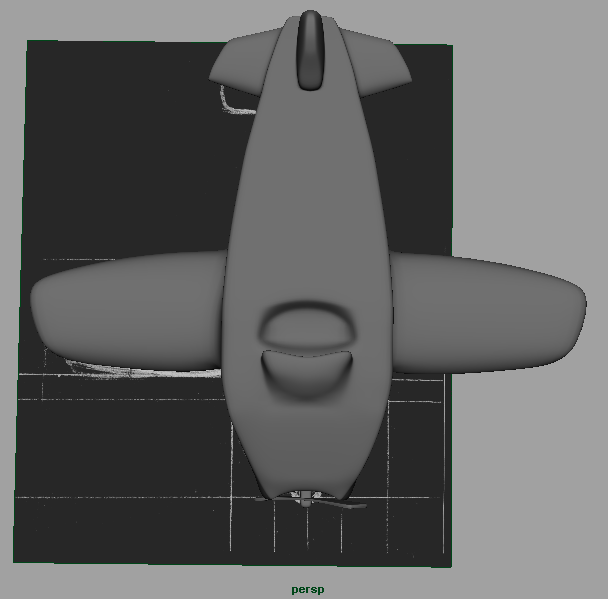
Over at Pigment Studios we now have a fully modelled and uv mapped plane, ready for a texture job. This prop is vital to our animation's message so it's great to have this ticked off the to do list :)


Wooden Plane Model

For my group project I was given the role of modelling the important wooden plane prop which is now complete. Here are a couple of images of the final result.


Sunday, 25 November 2012

Character Design: Villain Faces

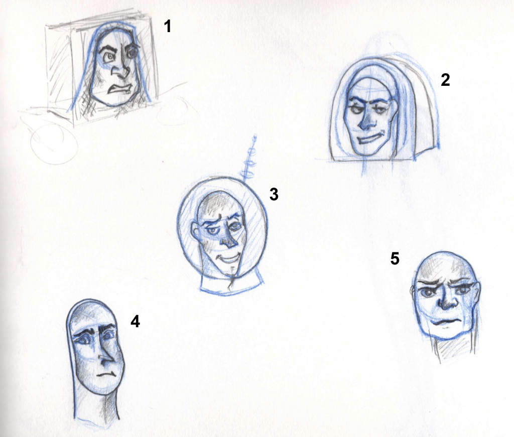
These are some experiments with possible faces for my villain I did a little while ago but didn't upload. #1 to me reminds me too much of Buzz Lightyear and #5 seems too old for the personality of my villain. I like the shape of #4 but in discussion with Justin he said it didn't scream space operatic villain! However, we both liked #2 because there is somewhat a sense of being vain about him so I will take him and develop him further to really make him reek evil space villain, definitely changing his helmet! :)


Previous Villain Shape Experimentation

Before I went on to create silhouettes for my villain I had been thinking about the type of shape I wanted him to be so I created a few variations to see which I thought would suit him best. I liked the idea of a really out of proportion body with a small head as the head was pretty much the only fully human part to be exposed because of the back story of his character so I went on to develop with that for my silhouettes.