Here is an archive of all of the maya tutorial posts I have put up together to help them be found easier. :)
Lip Syncing:
http://emma-foster.blogspot.co.uk/2012/10/lip-syncing-jaw-bounce.html
http://emma-foster.blogspot.co.uk/2012/10/lip-syncing-phonemes-visemes.html
http://emma-foster.blogspot.co.uk/2012/10/lip-syncing-tongue-and-blink.html
http://emma-foster.blogspot.co.uk/2012/10/maya-lip-sync-touch-ups.html
Cartoon Character- Modelling:
http://emma-foster.blogspot.co.uk/2012/10/cartoon-characters-part-1-modelling.html
http://emma-foster.blogspot.co.uk/2012/10/cartoon-characters-part-1-modelling-legs.html
http://emma-foster.blogspot.co.uk/2012/10/cartoon-characters-part-1-modelling_17.html
http://emma-foster.blogspot.co.uk/2012/10/cartoon-characters-part-1-modelling-arms.html
http://emma-foster.blogspot.co.uk/2012/10/head-modelling-dummy-eyes-blocking.html
http://emma-foster.blogspot.co.uk/2012/10/head-modelling-eye.html
http://emma-foster.blogspot.co.uk/2012/10/head-modelling-eye_25.html
http://emma-foster.blogspot.co.uk/2012/10/head-modelling-nose.html
http://emma-foster.blogspot.co.uk/2012/11/character-modelling-part-5-headneck.html
http://emma-foster.blogspot.co.uk/2012/11/character-modelling-part-6-ear.html
http://emma-foster.blogspot.co.uk/2012/11/character-modelling-part-7-hair.html
http://emma-foster.blogspot.co.uk/2012/11/character-modelling-parts-8-9-eyebrows.html
http://emma-foster.blogspot.co.uk/2012/11/character-modelling-part-10-model.html
Cartoon Character- UV Mapping:
http://emma-foster.blogspot.co.uk/2012/11/uv-mapping-legs-arms-shirt.html
http://emma-foster.blogspot.co.uk/2012/11/uv-mapping-shoes-and-head.html
http://emma-foster.blogspot.co.uk/2012/11/uv-mapping-complete.html
Cartoon Character- Skinning:
http://emma-foster.blogspot.co.uk/2012/11/skinning-part-1-creating-joints.html
http://emma-foster.blogspot.co.uk/2012/11/skinning-part-2-binding.html
http://emma-foster.blogspot.co.uk/2012/11/skinning-part-3-shirt-hands.html
http://emma-foster.blogspot.co.uk/2012/11/skinning-part-4-trousers.html
http://emma-foster.blogspot.co.uk/2012/11/skinning-part-5-shoes.html
http://emma-foster.blogspot.co.uk/2012/11/skinning-part-6-head.html
Cartoon Character- Rigging:
http://emma-foster.blogspot.co.uk/2012/12/body-rigging-part-2-spine.html
http://emma-foster.blogspot.co.uk/2012/12/body-rigging-part-3-arms.html
http://emma-foster.blogspot.co.uk/2012/12/body-rigging-part-1-feet-legs.html
http://emma-foster.blogspot.co.uk/2012/12/body-rigging-part-4-head-final-grouping.html
http://emma-foster.blogspot.co.uk/2012/12/body-rigging-part-5-controls.html
http://emma-foster.blogspot.co.uk/2012/12/mouth-rigging-part-1-adding-throat.html
http://emma-foster.blogspot.co.uk/2012/12/mouth-rigging-part-2-adding-teeth.html
http://emma-foster.blogspot.co.uk/2012/12/mouth-rigging-part-3-adding-tongue.html
http://emma-foster.blogspot.co.uk/2012/12/eye-rigging-part-1-blinking.html
http://emma-foster.blogspot.co.uk/2012/12/eye-rigging-part-2-eye-look-control.html
http://emma-foster.blogspot.co.uk/2012/12/facial-rigging-part-1blend-shapes.html
http://emma-foster.blogspot.co.uk/2012/12/facial-rigging-part-2-lip-syncing-face.html
http://emma-foster.blogspot.co.uk/2012/12/facial-rigging-part-3adding-face-camera.html
Cartoon Character- Turnaround:
http://emma-foster.blogspot.co.uk/2012/12/maya-cartoon-character-turnaround.html

Showing posts with label Character Design. Show all posts
Showing posts with label Character Design. Show all posts
Wednesday, 9 January 2013
Tuesday, 8 January 2013
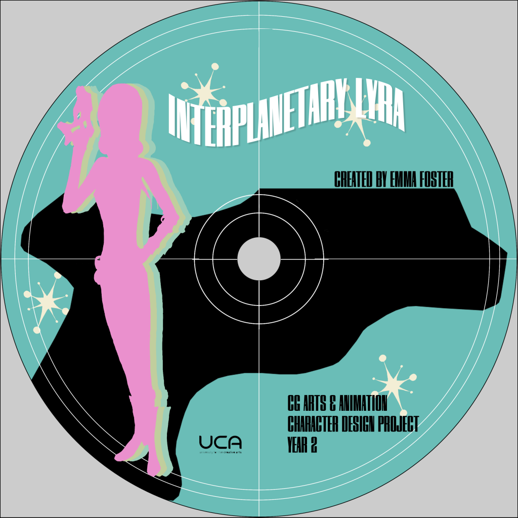
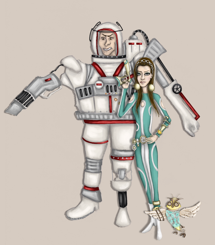
Character Design: CD Artwork
When it came to creating a design for my CD I really wanted it to embody the 1960s influence and theme of my work. I wanted it to be bold so I looked at 1960s art work especially more graphical pieces and film posters. I loved the use of silhouetting but decided it didn't all have to be about black silhouettes so I brought back in some of those bright funky colours the 1960s is known for.
I also finally decided on a title for all my character design to come under. 'Interplanetary Lyra'. I did a bit of research into 1960s titles for sci-fi and spy films and noticed they were normally quite short and sweet like 'The Avengers', 'I Spy' and 'Get Smart'. Some of them also had a bit of mystery to them such as 'Mission: Impossible' and 'Danger Man' so I tried to combine both for my title.
I also finally decided on a title for all my character design to come under. 'Interplanetary Lyra'. I did a bit of research into 1960s titles for sci-fi and spy films and noticed they were normally quite short and sweet like 'The Avengers', 'I Spy' and 'Get Smart'. Some of them also had a bit of mystery to them such as 'Mission: Impossible' and 'Danger Man' so I tried to combine both for my title.
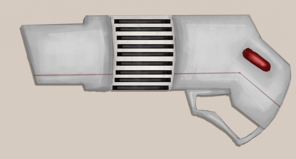
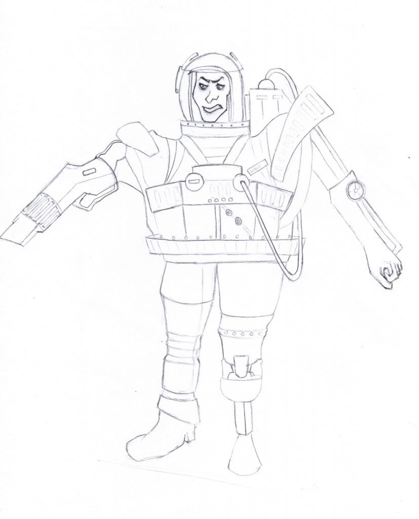
Villain Final Prop: Spacesuit Mounted Gun
Seen as my villain has been though a lot what with losing parts of his limbs I thought it only fair that he gets a chance with a gun attached to his spacesuit where the majority of his arm would be. That way he can aim it as if he was moving his arm and press one of his buttons on his suit with his fake arm to make it fire.
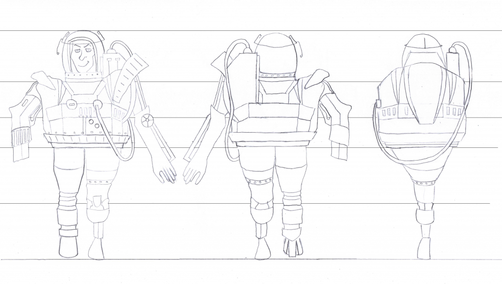
Villain Turnaround
This is my villain turnaround. It may look strange that in the sideview he doesn't have a face just the top of his helmet showing but this is due to the bulk of his suit coming up past his headline in the front and back views and his helmet having only a small see through section at the front where his face is.
Monday, 7 January 2013
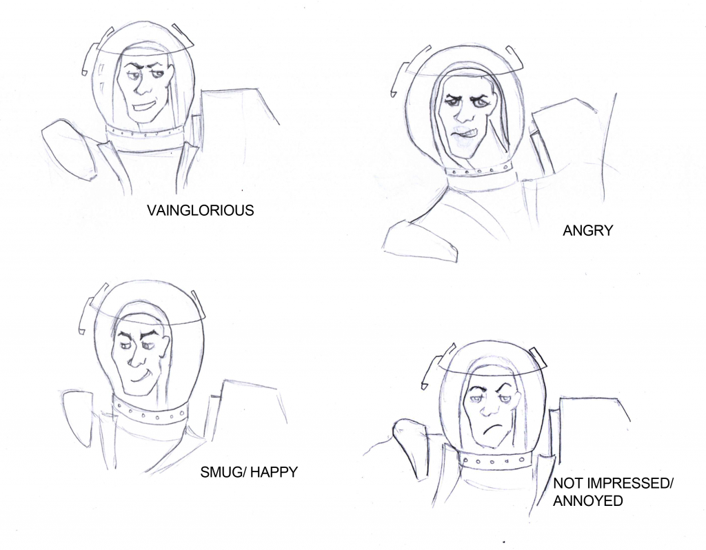
Villain Facial Expressions
My villain's facial expressions range from being full of himself to scary angry and while he looks a bit different when he is angry I quite like the difference because is as if he is turning ugly from being villainous.
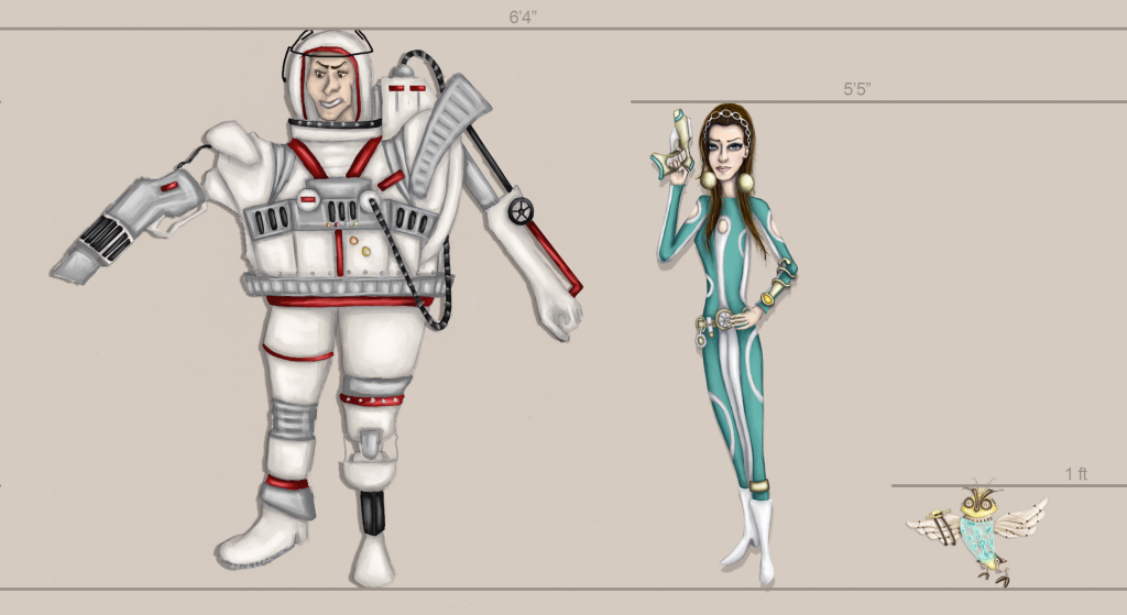
Height Comparison Charts
To really get a sense of my characters as part of their world here is are height comparison charts showing the different scales of each and allowing us to imagine what sort of form they would be if they were real.
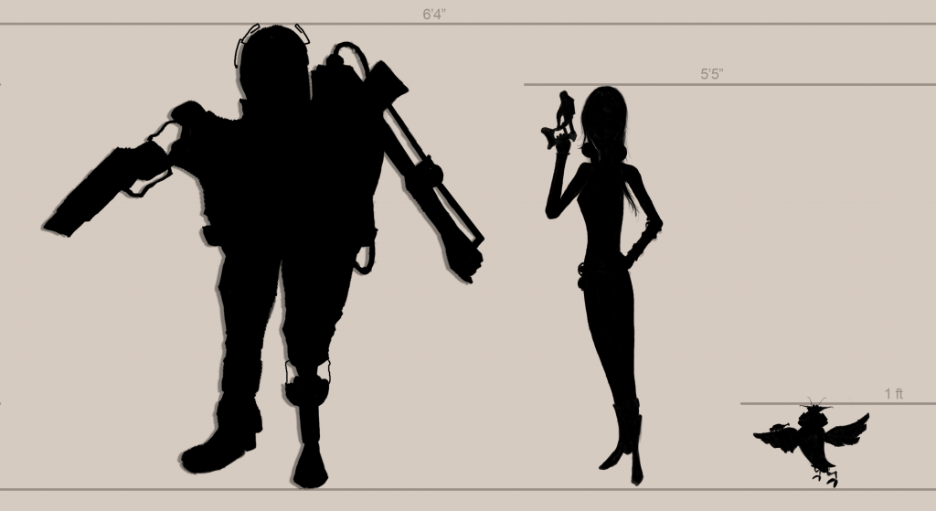
Height Comparison Chart- Silhouettes
Height Comparison Chart- Colour Poses
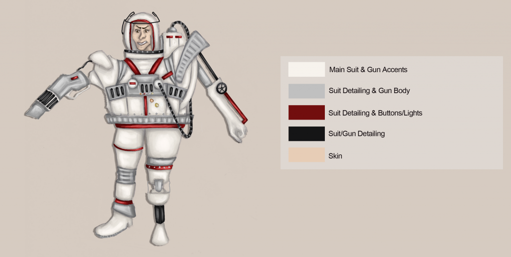
Villain Colour Palette
My villain colour palette, which is made up of a very minimal range of colours to link back to the 1960s appliance theme for him.
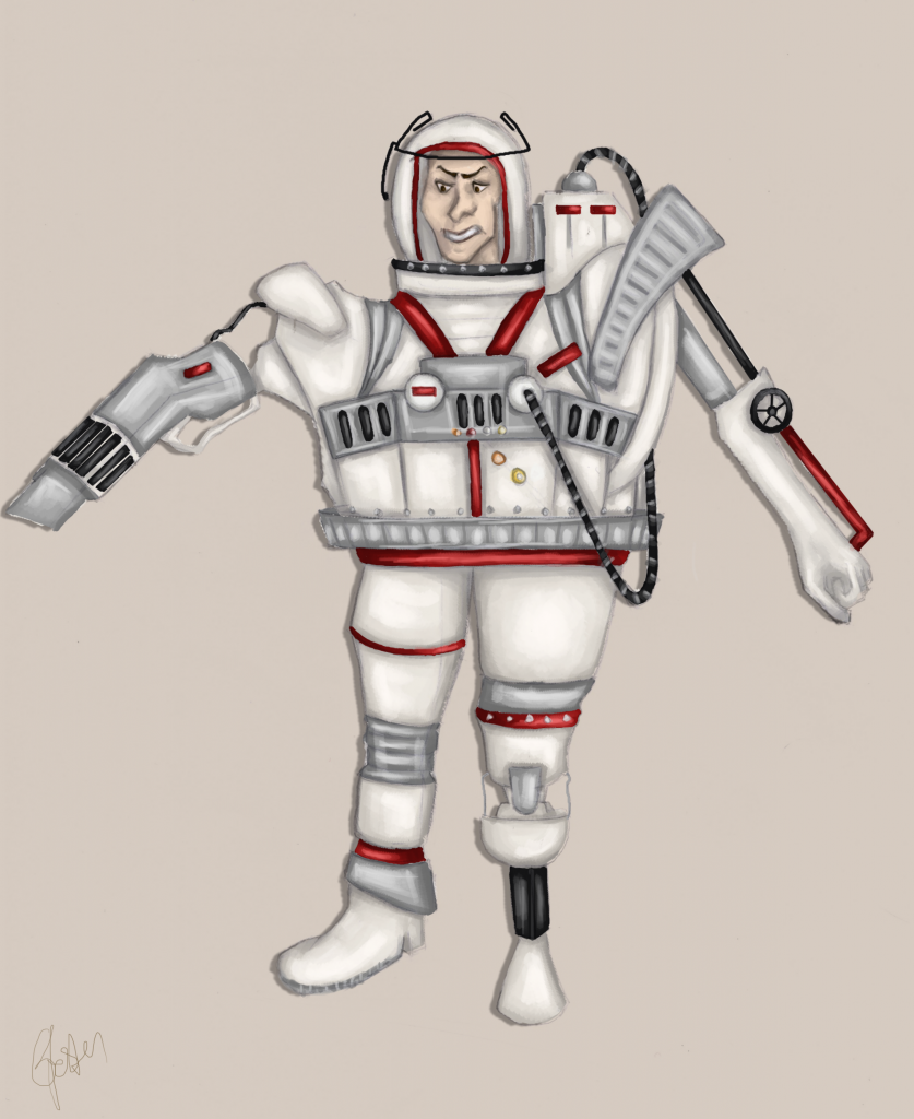
Villain Final Coloured Version
Here is my villain in his final colours. I wanted something very contrasting to my hero and sidekick but very minimalistic at the same time so again I looked at 1960s appliances.
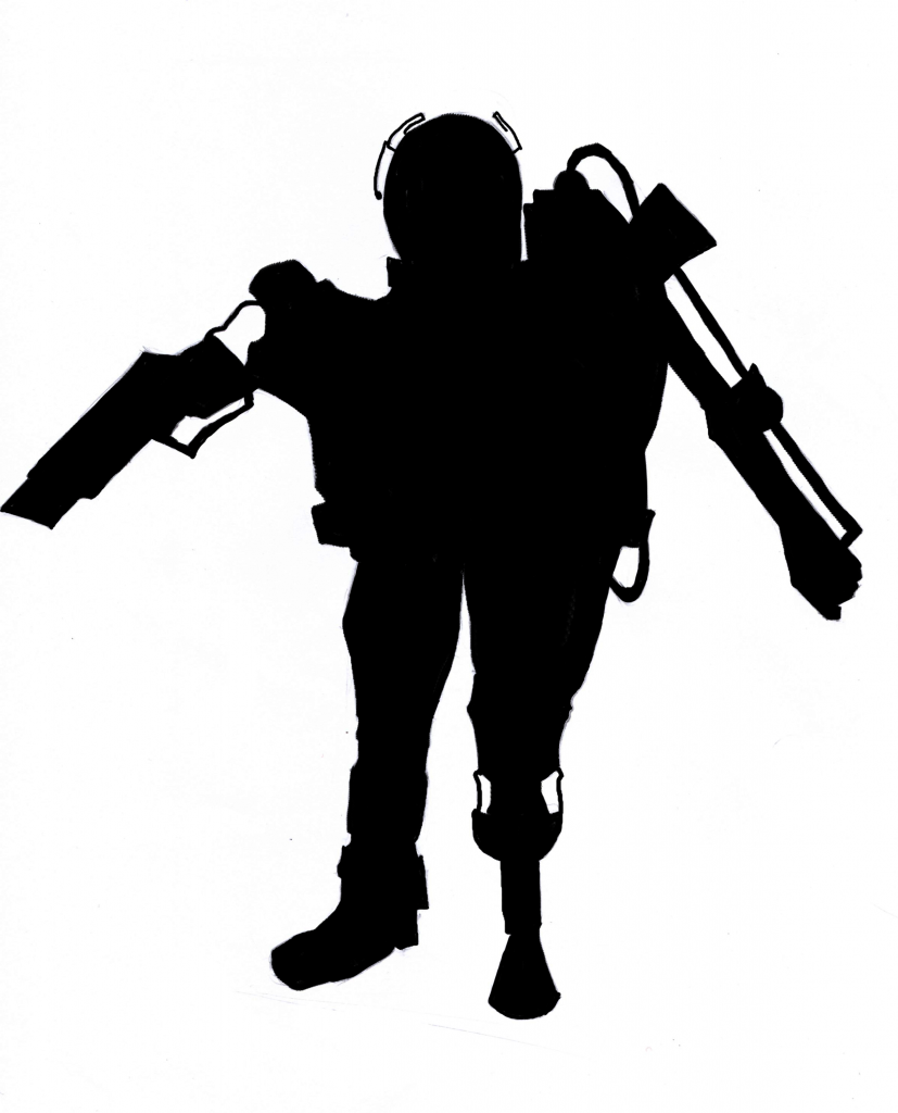
Villain Silhouette
This is my villain silhouette for me to check that I'm happy with the way he looks before painting him. He is very asymetrical which is what I wanted to show that there is something dodgy about him so I think I can go on to paint him now.
Sunday, 6 January 2013
Finalised Villain Outline & Pose
After many attempts at making my villain droop and hunch over a bit I got to a drawing where I realised that he just wasn't looking like the villain I imagined anymore. He had lost some of his snobbish body language. I had a think about how I could keep the snobby villain but also make his form feel real and as if it could be carried and decided then to re-attach one of his legs as this would help carry the weight. (He'll also be a bit happier now and might not rip our world to smitherings)
Villain Posture Development
I've already got my villain's outfit and shape and form sorted and ready to paint however there was something that me and Justin both agreed wasn't working and that was the posture of my villain. He felt as if he was standing too straight when really if he's lost parts of his body and has now got all of these heavy mechanical attachments until he supposedly takes over the world and gets his looks back he would struggle to stand straight. He needed either a sort of hunched over or dragged down posture which is what I was trying to figure out in these rough gesture drawings below.
1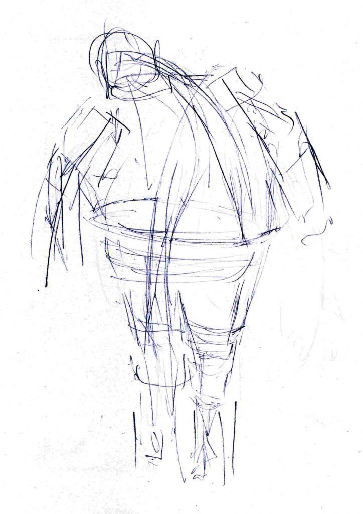
2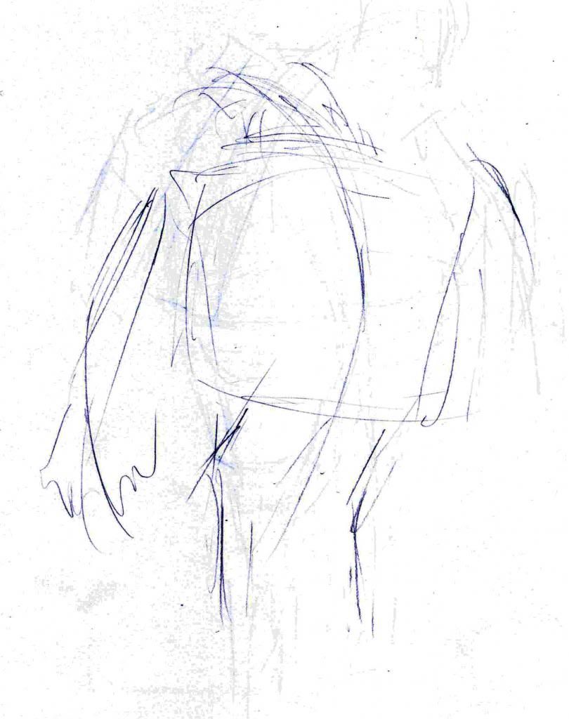
3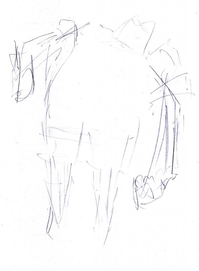
I think the dragged down to one side of #3 worked best as he looks as though he is trying to stand up straight but really struggling to.
Saturday, 5 January 2013
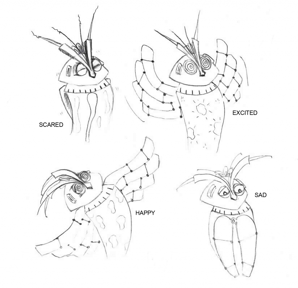
Sidekick Facial Expressions
I really enjoyed doing these facial expressions for my sidekick. I dunno if it's because I got to be a bit more experimental and creative with how to make him show emotion compared to human characters. I decided I didn't want his lava to just stay the same as this would be quite boring and unemotional so I have changed it's characteristics for each. When Aves is scared the lava stretches and wobbles as if shaking. When he is excited it pops and falls to the bottom of the casing. When he is happy it multiplies rapidly and when he is sad it sinks to the bottom while Aves swivels his head around to face the wrong way and keeps his wings folded up. :)
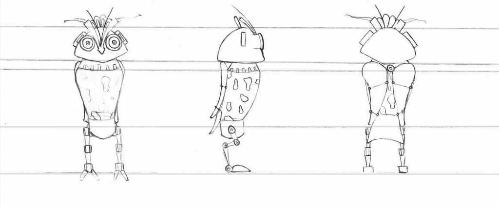
Sidekick Turnaround
Here is my finished sidekick turnaround. From the back it looks like I have changed his wings but I haven't promise! The bolts/hinges along the wings allow them to fold up so they fold up like a paper fan into each other. I wanted this rather than just having massive wings stuck on his back because I felt this kept to his sleek design on every other part of his body and didn't want a big chunk of wing to lose this.
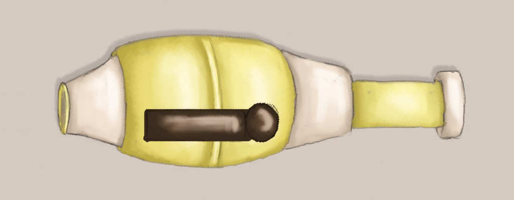
Sidekick Final Prop: Wing Mounted Gun
When it came to my sidekick's prop he needed something quite lethal to counteract his weaknesses as a fighter and more of a knowledge machine. However, because he is not much of a fighter it didn't seem him that he would hold it normally so I attached it quite un-naturally to his wing with straps. I also made it quite small. Whereas the hero's gun is quite chunky and the length of her head, the sidekick's seems small in comparison to his size. It's sort of there just incase he really needs to help fight otherwise the hero does all the action.
I also wanted to keep it true to his design so was inspired by 1960s hand massage machines and the smoothness of them which could match his lava lamplike body.
I also wanted to keep it true to his design so was inspired by 1960s hand massage machines and the smoothness of them which could match his lava lamplike body.
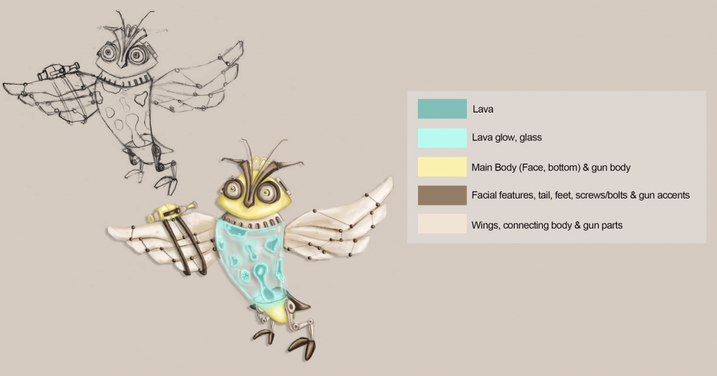
Sidekick Colour Palette
Below is the full colour palette for sidekick. Some colours are used for multiple parts because of the minimal colourways of 1960s appliances.
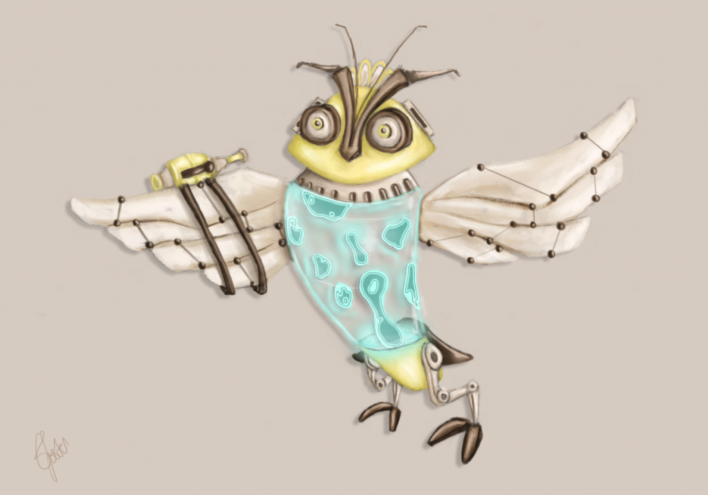
Sidekick Final Coloured Version
My coloured sidekick is finally finished. I changed up the colours from my tests a bit more as he seemed to work better with browns and creams/beiges and then the turquoise lava actually fit as well!
Because he is based on 1960s household objects and appliances I looked at a lot of them for colour layouts on them. This one was particularly inspiring because of its minimalistic but in your face colour.

Because he is based on 1960s household objects and appliances I looked at a lot of them for colour layouts on them. This one was particularly inspiring because of its minimalistic but in your face colour.
Friday, 4 January 2013
Colour Comparisions- Sidekick & Heroine
To help me with my colour choice of the sidekick I popped the colour experiments I did on the same canvas as my heroine to see which seems to sit best with her. I'm still not very sure but am now leaning towards #2 as I don't think he overshadows her but also stands out in his own right. I'm still not too keen on the silver though.
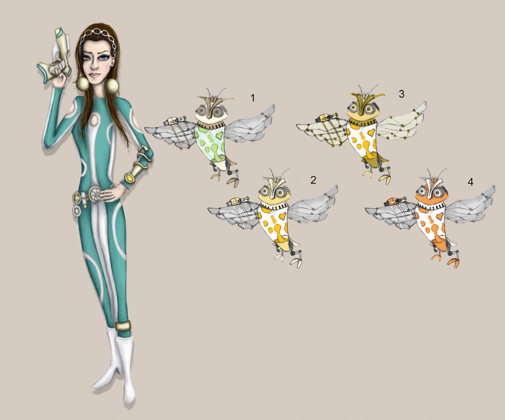
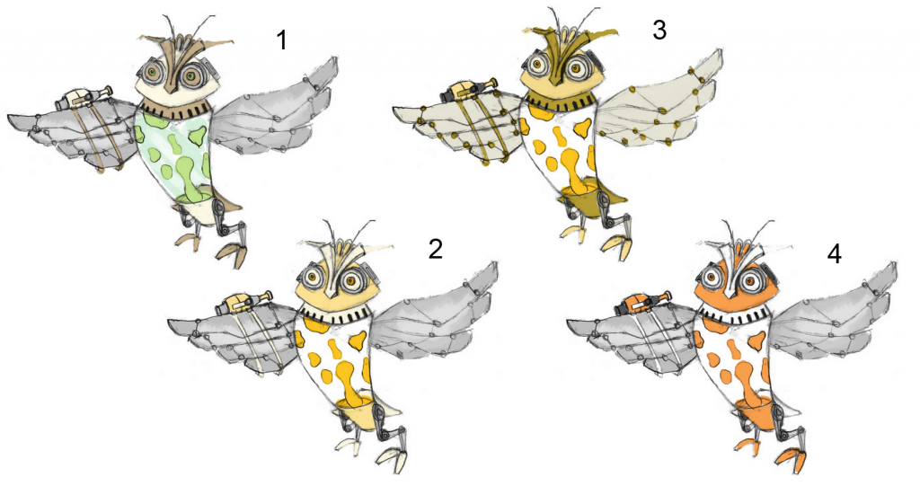
Sidekick Colour Experiments (Feedback Please!)
I have been experimenting with colour palettes for my sidekick below. The colours are already limited to colours that compliment my heroine nicely so there are not as many because they have been narrowed down. I did one experiment with turquoise lava but it just linked to my here too much and made my sidekick sort of fade into the background so I tried to think of other colours that compliment turquoise/teal and settled on a sort of yellow or orange, beige, brown or a light green colour. These are the colours I experimented with below but tried to limit to a use of 3 colours in each experiment. I also used silver as the metallic parts but I'm not sure if this works or whether more beige would. Perhaps going the same as my hero with gold?
Which do you think works the best or are there any other suggestions for colour ways I could go?
Which do you think works the best or are there any other suggestions for colour ways I could go?
Subscribe to:
Posts (Atom)