I also thought of how to make the switchback railway sit more as a part of the stand when it is added. Some things I wanted to try were:
-Leads up to the top of the stand where there is an observation/viewpoint and a place to try food from Fogg's travels.
- Leads up to the balloon which acts as the switchback tower as well as another ride.
-Acts as the entrance to the stand.
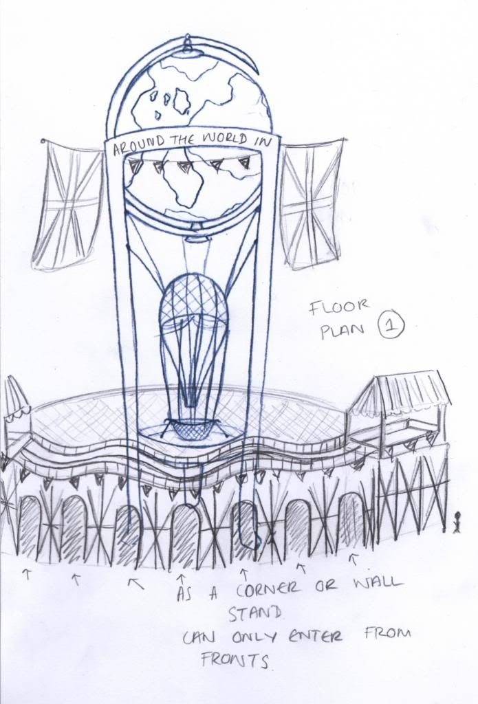
I think Floor Plan 1 has its good parts and bad parts. The switchback railway addition does not detract from the main centre piece but actually makes your eye travel up. It also works well as entranceways. However it is not clear where the stand finishes because the railway does not cut it off around the back so this would only be suitable for a corner/wall stand. This is not what I want though because the viewer should be able to explore all around the stand.
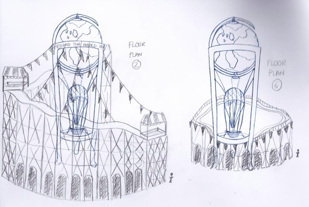
I liked the way Floor Plan 2 surrounded the stand but I think it is too tall as it covers up too much and also does not follow the conventions of the height of a typical switchback railway in these times so I don't think it would be possible to lead the viewers up to the top of the stand because of this.
The height of Floor Plan 6 does work well with the back being higher too but I don't think the centre piece should be at the front as after you have entered you do not have this grand spectacle to look up at anymore.
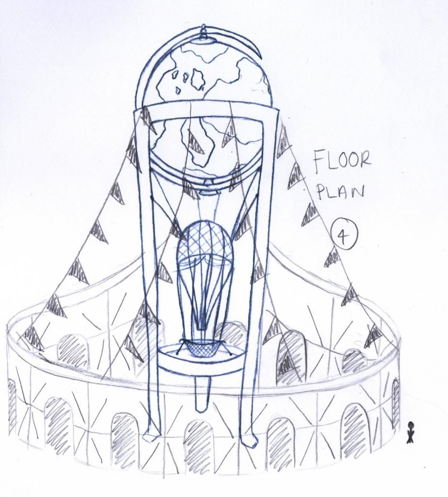
Floor Plan 4 seems to work the best with the centre piece nearer the back so that the viewer goes in to see it. The height for the ride also seems about right in this one however if I want it to connect near the balloon to use that as a tower for the ride as well as another attraction I may have to make the centre piece taller.


1 comment:
yep - 4 is looking good.
Post a Comment