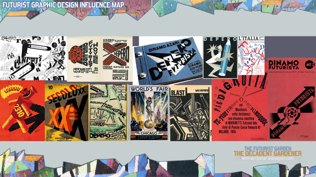
Lastly as my main wad of Futurist art research I had a look at the graphic design as I am always interested to see how people apply styles to graphic design. The very interesting thing I noticed though was that there are less base 'shapes' about their graphic design than their other work. So only a couple of triangles and circles here and there. Instead the typography is used to create shape similarly to some info-graphics, in fact that is what some of Futurist graphic design is! For example, in the top second from the left one design the text is implicative of their architectural structures.

2 comments:
Hey Emma - yum, lovely rich research, so excited to see how all of this might translate into some striking thumbnails! The other bit of research your going to need is to understand the structures of flowers and plants - and all the different types. You might also want to do a bit of research (and this is going to sound a bit vague) into 'fashionable' colours of the Futurism period, or the history of the manufacture of colours during this period (for example, there might be especial blues, oranges, yellows, reds associated with new (or 'new' back then) manufacturing processes or dyes or inventions. My general point is that you should also research the period in terms of synthetic materials and plastics of the age (as if your digital set has no choice but to be manufactured from the elements available to the Futurists). It would make for another fascinating strand of research!
Thanks Phil! I'll move on to do that next then :)
Post a Comment