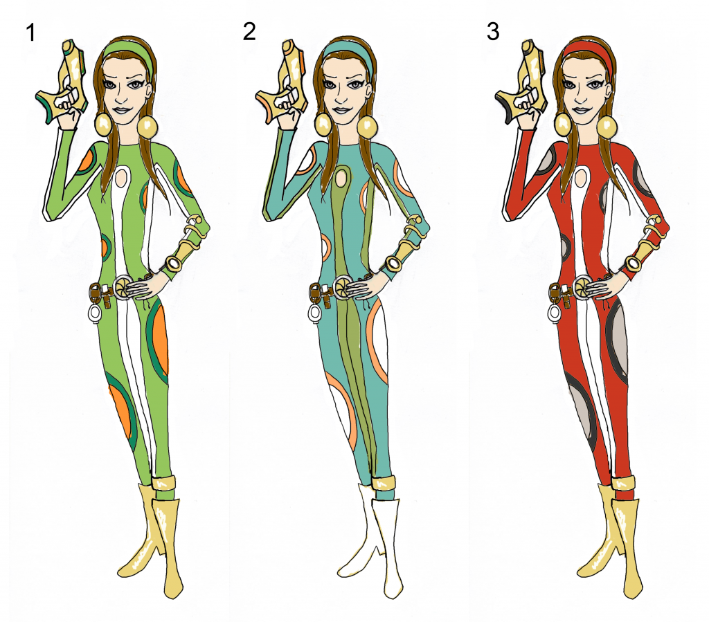
I've done 3 more colour experiments. I realised I didn't do a red colouring so gave this a go with the striking black from space age fashion which I think looks pretty cool. I also tried a brighter green as the greeny blue ones had seemed to have more positive feedback from people. I then took the one that seemed to be most successful from the original colourings and adjusted it a little by making the colours a bit brighter as I didn't think they were quite 1960s enough. I also got rid of some of the green as I thought there was too much and added in a more space age white. I then thought there was also too much gold and added 1960s white boots to finish it off. I think that I'm leaning towards that one but suggestions of improvement would be very appreciated :)

5 comments:
I love how the colours work for number 2! Maybe try to make the headband that orangey colour and see what that looks like! I love that golden piece on her arm, beautiful. (:
Ohh thanks for the tips Alice! :D
In terms of contrast, your first black and white image from below is absolutely cracking (although a liitle too striking for the hero). Personally, I think adding too many colours is taking it away the design. Perhaps try something similar with just torquise, gold and white? from 2.
Anyway,coming on very nicely.
Justin
Thanks Justin I'll work on loosing some colours then :)
Ow gee these really remind me of a cartoon program! ow gee the designs you would lovely, may get some more ideas on colour to...erg if i could just remember what it was called...something spy.... totally spies? Yeh anyways, im loving the retro feel here very nice :) But I must say I liked the black and white one the most.
Post a Comment