cff
Wednesday, 6 March 2013
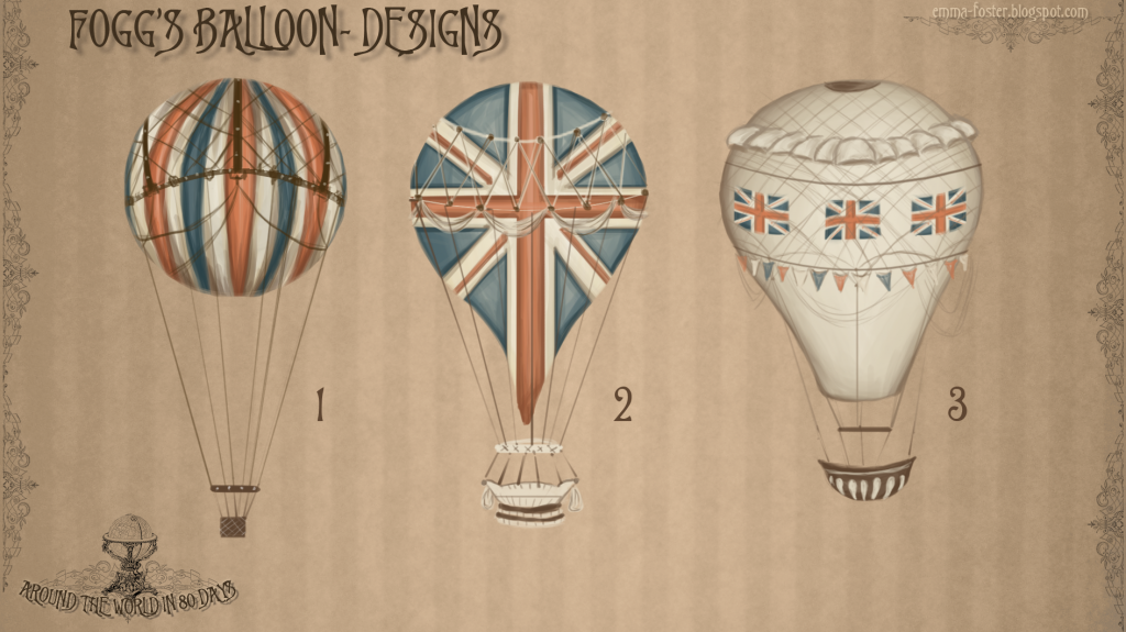
Phileas Fogg Balloon Designs
When designing Fogg's balloon I wanted the British celebratory mood to continue through it but I also didn't want to take it too far as there is already a lot of bunting, flags and all things British Empire everywhere in the stand. In its own right I wanted the balloon to stand out from it all but feel a part of this world too. Out of my designs I think #2 would camouflage too much with the rest of the scene but there is something I like about #1's simplicity in shape and pattern. I do however think #3 would stand out most in its own right but still sit well in the scene. I also think this would make a nice ride for attraction-goers.
Subscribe to:
Post Comments (Atom)


4 comments:
All three looks great but in terms of British-ness I think 2 would work best. However you did mention you were worried about it blending in and if that's the case I would go to number 3. Number 1 is good but the way you've done the red, blue and white stripes remind me more of a French flag rather than the UK one :). Still, like how you've laid these out to
Thanks Charlotte that's really helpful! :)
These are awesome emma, keep up the good work! number one and number three all the way :D
3 seems the most alluring
Post a Comment