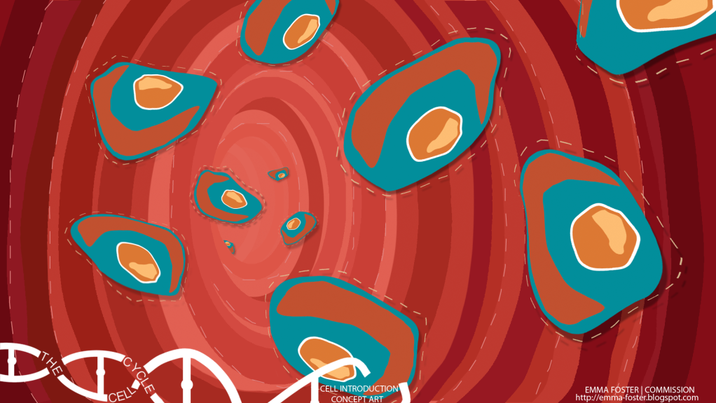
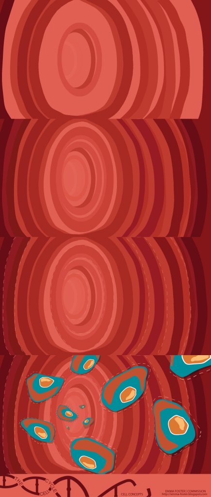
For my first concept I have focused on portraying the introduction of the cells to the animation. I think this is probably one of the more difficult stages to portray as you really need to show just where they are. So I have attempted to simplify down the well known images of cells going through the body to a more Saul Bass style.
I'm not too sure that it is Saul Bass enough because it seems quite busy but I know there is only so far I can go to make it simple but understandable scientifically. I also think this could work with the original background from the titles shrinking down into the circle at the back of this tunnel and all these colours whizzing on to form the rest. Then when the cell starts to go through interphase moving onto a more blocky/solid coloured backdrop as the whole interphase will be more important than the background.


2 comments:
Pow!
BUT - is it necessary to make the cell walls as red and 'real world' as that? If you've made the leap with the colour scheme of the cells themselves, doesn't that free you up? I can't help feeling - as much as I think this concept art is wonderfully vivid - that you may be mixing your metaphors here; very stylised + not so stylised = ? What happens if the cell tunnel is a world of blues instead? Isn't that 'more' logical than a real world of bodily reds? What do you think?
I can see where Phil is coming from, I do love this (even with the red :) ) but yeh try mix and match colours as you may find that they do not works as well as this, or that they are better :) still a lovely piece of art work and I'm so looking forward to the finished out come!!!
Post a Comment