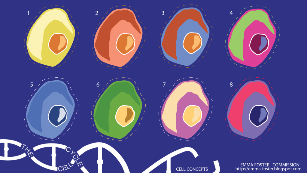
After some feedback from Phil it was back to the drawing board to try and simplify my cells further to really correspond with the art direction I am following. It was also important to really neaten up the cell forms so they looked more like they came from a graphic design background. I started off attempting this in Photoshop but it soon became clear that I just wasn't achieving the effect I wanted and so knowing that Adobe Illustrator can be a preferred tool for graphic design I attempted some experiments there.
Below are the ones I have produced so far using the blue/purple background as a basis for linking in the colours that feature on the actual cells. This link between colours is an important element in my design because of the solid colour background I need to have which my cells etc. will sit on. This colour cannot clash because it has to make these objects more attractive and noticeable.


3 comments:
These are lovely Em! I like numbers 2, 4, 5 and 8! (: x
for me, it's 5, but with orange as an accent colour for different components inside the cell etc. I think the blue + orange gives you your retro feel - it feels very resolved. I suggest what you now do is produce, using the eye-dropper tool - is make a master colour palette combining your blues and oranges (including white) and use it to establish the rules of your world so far.
Im still a lover of 1 but i do like 2 as its the only colour i can stand with the blue background. The others for me, somewhat get lost within the background :( but I'm loving that you finally happy with your style!! very cut out and bold!
Post a Comment