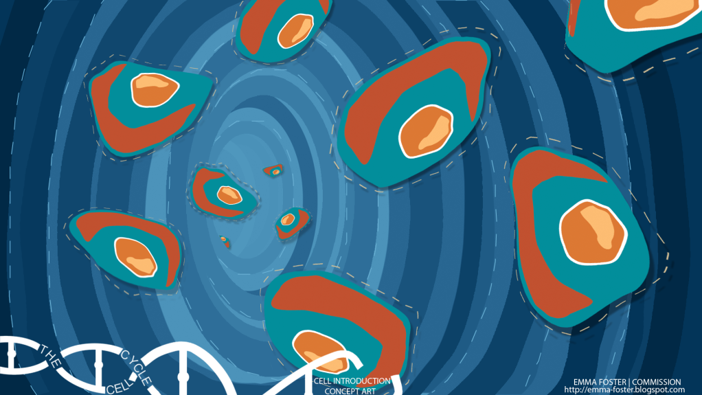
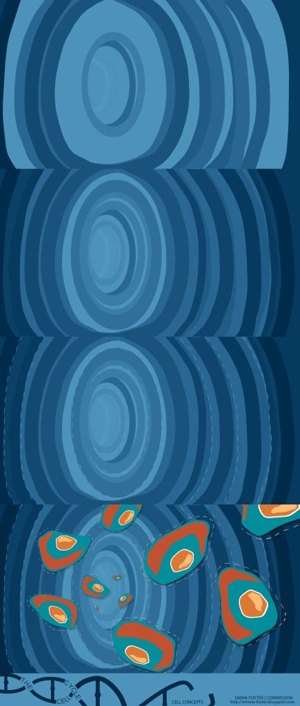
After feedback from Phil I went back to the drawing board to play around with some colours that were less realistic and more stylised. I used the very helpful colour scheme designer where I put in the main colour of my cell and looked at colours that came up alongside it. I attempted a range of them but none of them worked as well as this one which I colour overlaid onto my previous version.


2 comments:
:) the blue looks epic. The red is also good but i feel with this now, that this is your world that you have made. with the red all i could think of was loony toons (which isn't a bad thing as i liked that) but yeh :) should be pround of this hun! it looks grate ! :)
Hey Em,
You see, this suddenly feels much less 'confused' in terms of your art direction; here, you're not making your audience compare your world with the 'real' world - you're just asserting an environment with its own consistency. I would suggest too that you could probably reduce the number of stripes in your cell wall - so for example, thick bands towards the camera, with thinner bands receding, to help you create the space; try it maybe with a maxium of 5 bands to convey the space, as this might give you a bit more of that Saul Bass feel - that said, I don't dislike what's going on here in this piece at all; indeed, I'm finding all this work to be very punchy and satisfying - have a go and see what you think!
Post a Comment