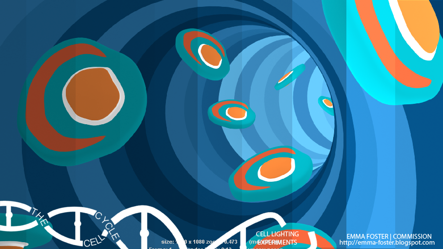
For my art direction to come across well in my animation I have to get the lighting right so that it doesn't leave shadows, or do things such as make the models too 3D or 2D.
To figure out how my lighting could look I rendered out the model practise I have been doing with changes to the lighting's intensity and ambient shade.


1 comment:
I am likeing the middle area of this test due to the two ends are a bit to dark and to light.
Post a Comment