I also like the brightness of the teal colouring of the cell, some of my friends even told me that this teal colouring likes to appear accidently throughout a lot of my work so I thought why not embrace it!
Here are some colour palettes focusing on the world around this cell. I have done a few experiments with them including using the cut out filter!
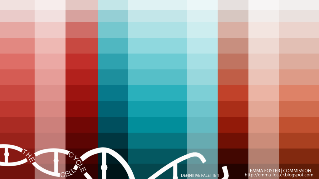
Combining the palettes from before and adding some more darker and lighter tones.
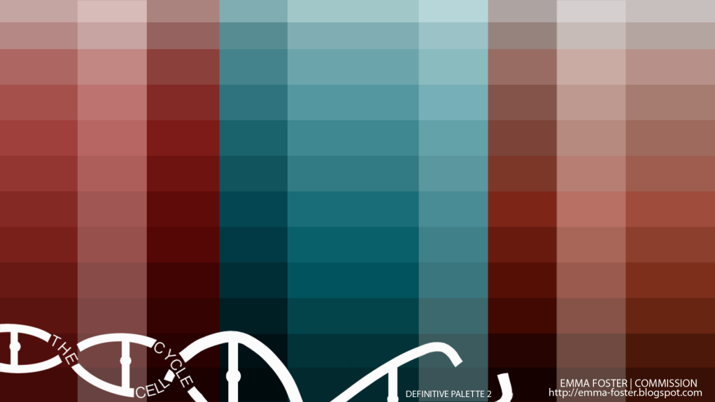
Taking away some of the brightness and contrast.
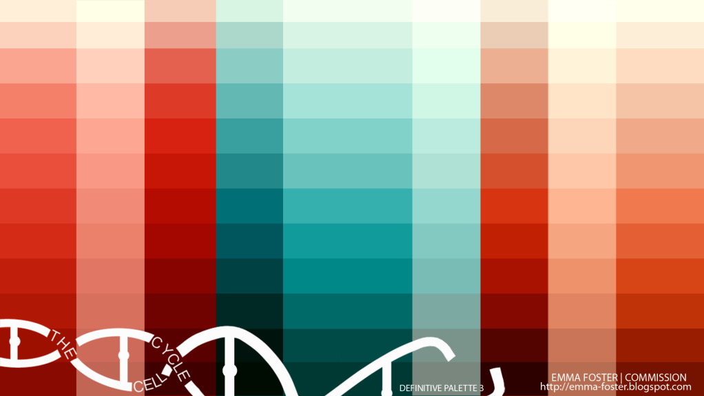
Upping the colour balance of the red.
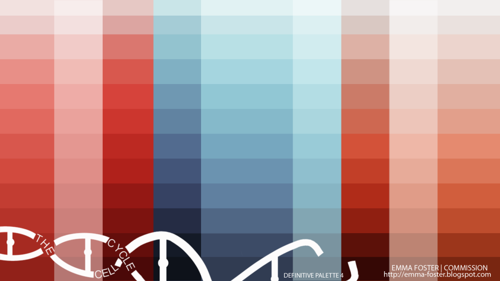
Some selective colouring. I actually like this purple/blue as well!
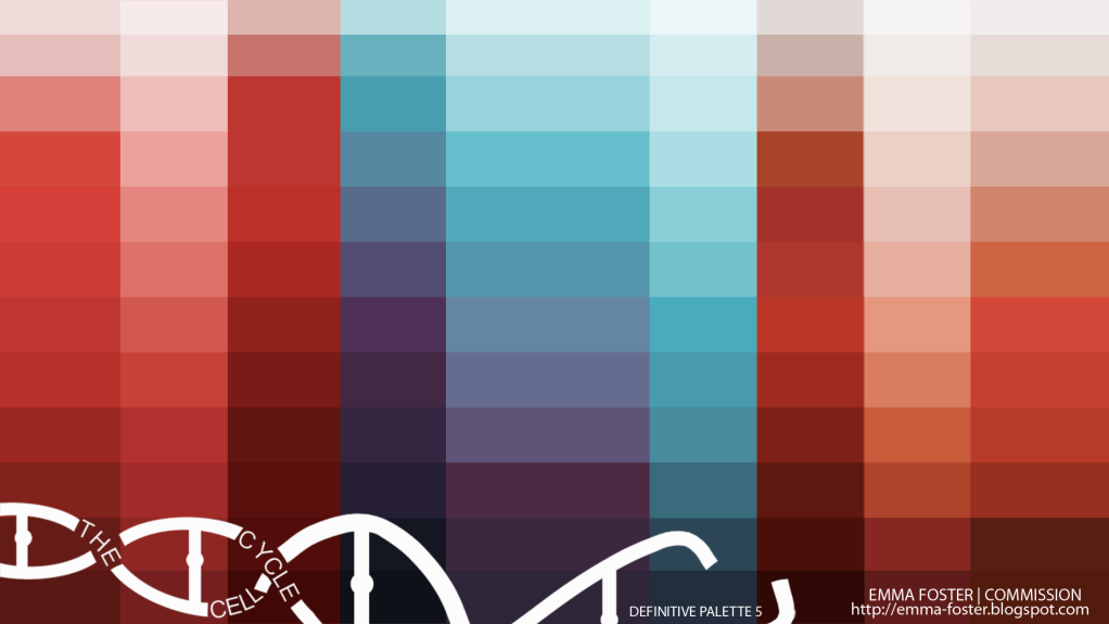
Some more selective colouring.
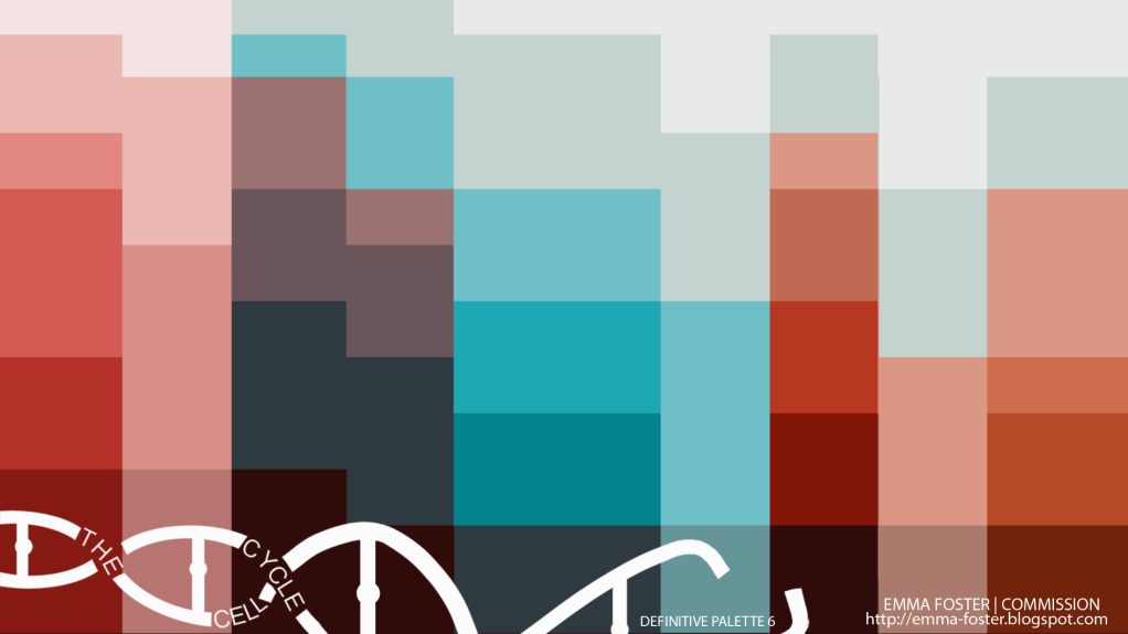
An accident with the cut out filter! But I like how key colours have been picked out and mixed.
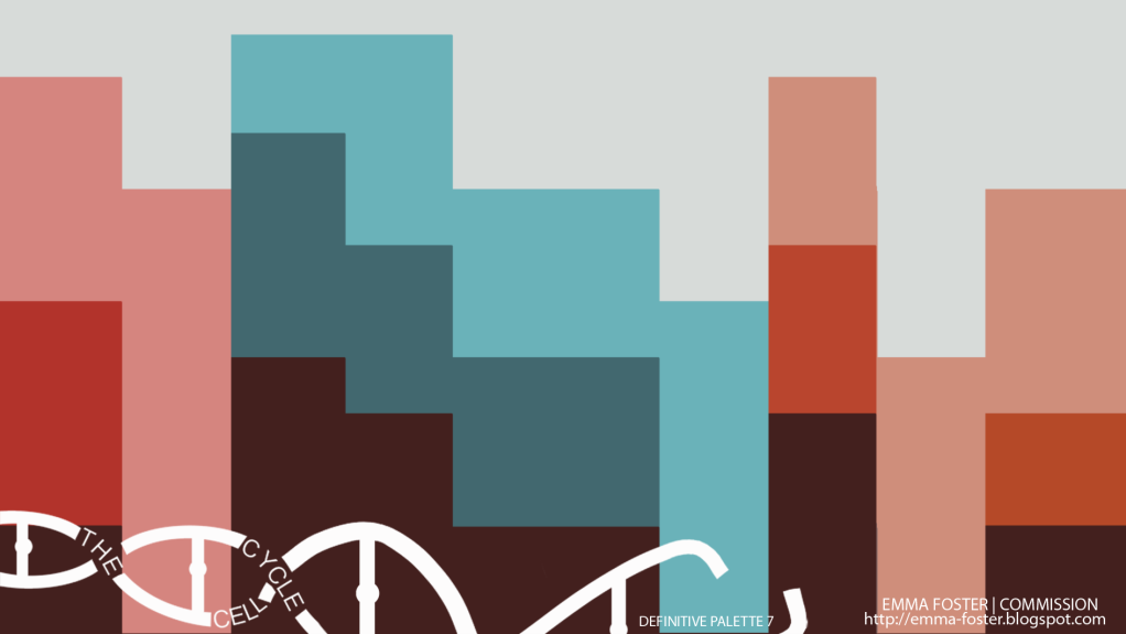
An even more simplified play with cut out

1 comment:
its the red and purple for me :) These colour tests are good but from this i can't picture you cell. Try adding these colours to your cells as these colours may look good on your tests but how to you know they will look any good on your cell if your do not try :) I know you been trying that before and thats why those where more helpful to you i think as people could see what it would look like as with this I'm having to think very hard how it would effect your cell :) still, leaves are lovely. I also love the very blocky feel that the last one has :)
Post a Comment