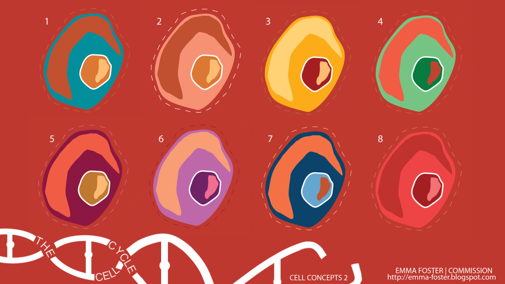
Some more cell designs with a different background colour to affect the other colour choices. I also tried to smooth out one of the cut outs to make it follow the cell shape better. I am really starting to be able to see how I could put these together to achieve my Saul Bass art direction as well as visualising how each individual component of the cells could be animated.


8 comments:
love number 1
woohoo! 7 an 1 !
Haha thank you! Ohh decisions decisions! :)
3 and 7 for me :) very bold and very very nice :)
Also another thing, I love your branding :)
1 and 7...but I like number 3 even though it is a clash of colours.
I also love your branding, really nicely done :)
Thanks Chrissie :D
Number 1 (:.. Emma these are beautiful!
Post a Comment