

Tuesday, 1 May 2012
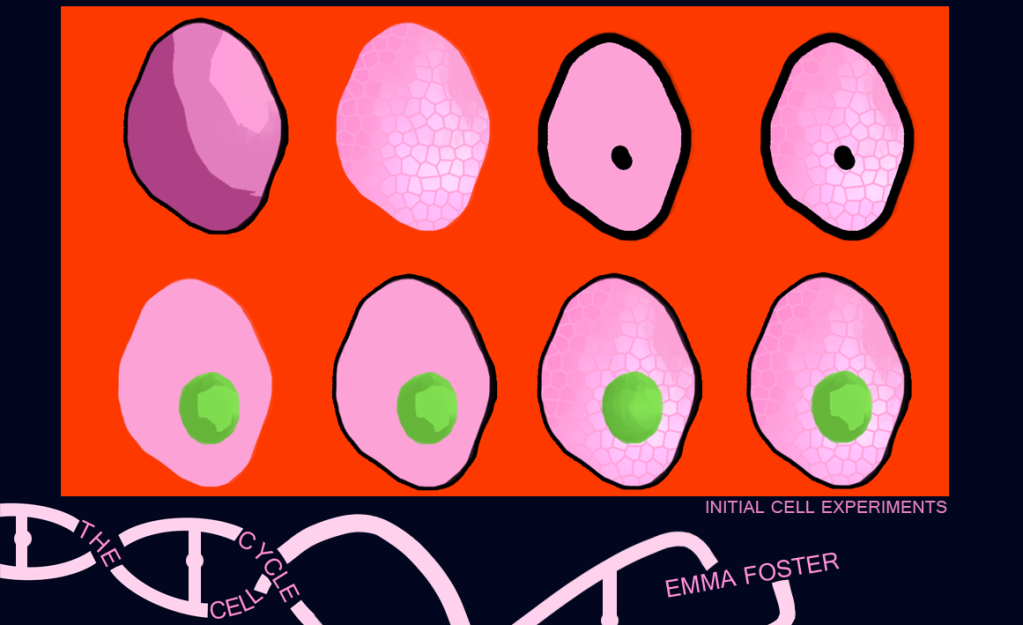
Initial Cell experimentations
Here are my initial cell designs. I have been playing around with the cut out filter as well as others and trying to use colours opposite each other in the colour wheel to really make an impact. I'm next going to experiment with more colours and filters to see what else I can achieve with these.
Subscribe to:
Post Comments (Atom)
3 comments:
hi hun! first of all, im loving your template :) Of strongest (for me at least) one here is your first one as it seems to go more with your cut out style than the rest. This is due to the block coloures (to which are in all of your examples of this style) compaired to your other to which has cracks of texture. I think you need to play around with block colours and see what happens. Let go and relax a little. Its still a very good start non the less hun keep it up !!!!! :) see you soon and have a nice day now!
I think you need a tidier line/shape - more iconic and graphical than 'drawn' and sketched. Take a look at the illustrations of Charley Harper for an additional reference in terms of this block printing stylee - and take special note of the strong, unbroken arcs/curves/shapes - and real confidence in terms of simplifying visual language:
http://ucarochester-cgartsandanimation.blogspot.co.uk/2011/06/supplement-charley-harper.html
And, apologies if I'm repeating myself here, but in terms of colour design, use this for determining your punchy, confident color collisions!
http://ucarochester-cgartsandanimation.blogspot.co.uk/2010/12/online-colour-scheme-designer-and-its.html
Also - in terms of your layout, I'm not keen on how 'cramped' your images look in terms of the cropping - the edge is really close to the bottom of those cells and it looks like you've made a mistake; also, if you're going to put your cells on a red background like that, then make the whole presentation page red, and turn your cell-cycle ident black; then, if you put your cell designs on another colour background, say orange, you can make the whole page orange, and have the ident black; as long as the ident itself stays the same size and in the same location on the page, you can change the colours of the pages and the whole thing will still cohere; right now, your page looks bitty - too much competition for my attention; try simplifying and being more 'saul bass' about it.
If any one of this sound unduely critical, it isn't - it's fab that you're getting stuck in and posting it - which is why you're getting the feedback now. Onwards, my dear, onwards! :)
(and use the Colour Scheme Designer - it works!)
Thanks Phil this has been a big help! :D
Post a Comment